Colour coding in Roche Fusion
Roche Fusion is a fast game. A very fast game.
This makes it very important that the player always has as much of an overview about what is going on as possible. A big part of this is visual communication.
One important aspect of that is the colours we use for enemies, players, projectiles and even the game's backgrounds.
Player colours
The most obvious colour coding of the game is the colour of the two different players in Roche Fusion's co-op mode. When deciding on the player's colours, we know that they had to be easily distinguishable.
That is why we went for bright-blue/cyan for the first player, and yellow/orange for the second.
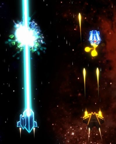
This combination is also easily separable for most forms of colour-blindness, which we believe is an important consideration.
Note that the projectiles of the player's weapons - and this includes all of the powerups and other weapons available to the player throughout the game - are colour coded as well. This allows the players to tell apart the ships, even when not directly looking at them, since it increases the footprint of the player's colour on the screen.
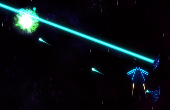
Even drones - little companion powerups the player can collect - shoot in the same colour.
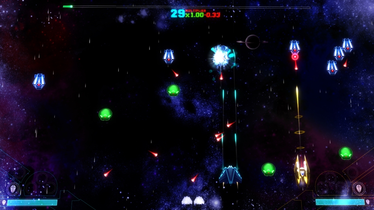
Note how the HUD of the two players follow the same colour scheme as well. This is important so each player knows instantly which side of the hud belongs to them, even if the ships may be on the opposite side of the screen.
Further, none of the enemies in Roche Fusion shoot cyan or yellow projectiles, which allows for a distinction in colour between friendly and harmful projectiles easily, even though their shape can sometimes look similar.
It is important to note that this does not hold for all forms of colour blindness however. Especially red enemy projectiles and yellow player projectiles might be difficult to tell apart with red-green blindness, which is the most common form of colour-blindness.
Given the limited range of colours available, we decided that this was a tradeoff we were willing to make however. Fortunately, colour is not the only way to tell projectiles apart: An even better and easier distinction is that the player's projectiles tend to fly upwards, while the enemies' projectiles tend to move down.
Enemy colours
As was mentioned in last week's post, enemies in Roche Fusion are colour coded by their behaviour, and also use different shapes to be easily distinguishable for colour-blind people.
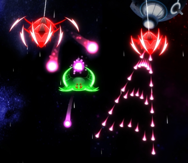
In addition, we use subtle colour coding for different enemy projectiles as well. This is not a necessity, since everything that needs to be communicated is done so by shape and behaviour, but it is a neat additional detail.
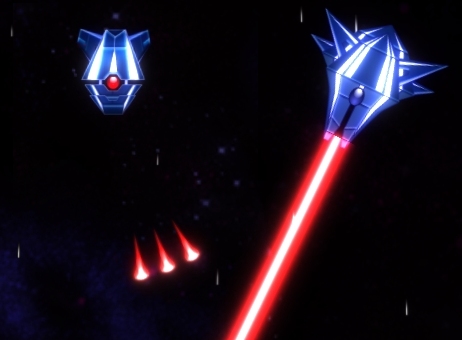
Overall all enemy projectiles are in the range from red to purple and pink.
In detail, red projectiles (including lasers) are the simplest ones that deal simple direct damage when hitting the player.
Pink projectiles are bombs that explode after a short while, or when hitting the player. (Note how a particle effect in the screenshot above distinguishes between the slightly different bombs of spiders and squids.)
Lastly, darker, purple projectiles (not featured here) are fast and homing, and can deal significant damage depending on their size - though, overall size is a good estimator for a projectile's damage in Roche Fusion, even extending to the width of lasers.
I hope this has given you insight into how we use colours - and shapes - to help the player understand what is going on in a game of Roche Fusion.
Maybe you also found our considerations regarding colour-blindness interesting. I certainly enjoyed reading up on the topic at the time, and making decisions that allow colour-blind people to enjoy Roche Fusion, without having to make compromises in the game's graphical quality or colourful palette.
Enjoy the pixels!