Pretty protection is pretty
One of the first things I ever implemented for Roche Fusion - in fact before we even officially started the project - was a shield for the player.
That shield was essentially a round sprite that was mostly opaque on the outside and faded out to the inside.
The lower the health of the ship, the higher the opacity of the shield would be to warn the player of their impending doom.
You can check this video for how it used to look:
Not terrible. But also not terribly pretty.
Several months ago I decided that I had enough of ugly shields and set out to design and implement a better system.
Here is what I wanted it to do:
- Look more 3D;
- Light up in the direction the player is hit from;
- Have a pretty pattern;
- Flicker more and more, the lower we get to zero health.
The pretty pattern and flickering are pretty trivial, using a texture with a hexagonal pattern, and some random transparency flickering that increases when health drops.
The other two are a bit more complicated.
What I could have done was draw a sprite that is only part of a shield in one direction for each hit, rotated in the right way. However, that only works if the number of hits per second is fairly limited. Further, overlapping sprites may look strange or even just bad.
So instead, I came up with the following:
I would simulate the shield as a regular polar grid (rings and spokes). To make it more clear what I mean, take a look at this image:
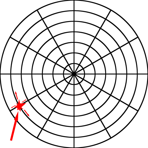
Each intersection in this graph is a point for which I start how opaque (non-transparent) it is. When we are hit from a certain direction, I find the point closest to it, and make it very opaque.
Then, every frame I go over the entire grid and apply a weighted average filter to each element and its neighbours. In technical terms, I convolute it with a simple triangular kernel.
The weights do not sum up to 1, so over time (not that long really, just a few split seconds), the shield goes back to being transparent.
I then create one vertex for each point giving it the point's transparency, and connect them with quads, just like in the image.
While I am at it, I do not just make it a flat disk of shield-geometry, but give it a bit more of a hemispherical shape to make it look more 3D.
And that is all!
Check out this video for how our shields have looked since then:
And here is a screenshot I made just the other day while giving a larger version of the same shield to a boss we are currently working on, and that we will be adding in our next and first big update!
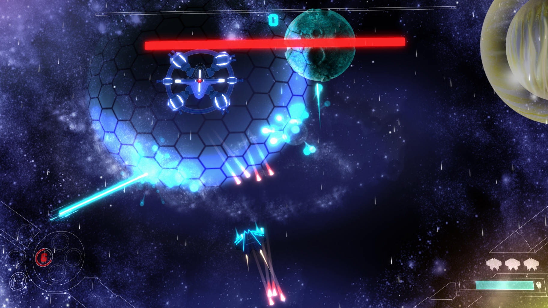
(click for big image!)
I hope you found this interesting.
Let us know what you think, and if there are any topics that you would like us to write about in out future devlogs.
Remember, we will be posting every Friday for the foreseeable future!
Until then,
Enjoy the pixels!